Saturday, August 16, 2014

Awesome Mix Vol. 1 (Or, Guardians Of The Galaxy Nail Art)


Have you seen Guardians of the Galaxy yet?  If you haven't, you should go now.  Today.

In fact, if you still have your safe-for-work beige polish on, skip to Step 2 (and then while you're waiting for Step 3 to dry, you can buy your tickets online), and you'll have some awesome nail art to go along with the awesome soundtrack that you'll soon be hearing!


Here's a list of the Things You'll Need for this nail art:

  1. ScotchBlue Painter's Tape
  2. Beige Nail Polish (that matches the look of aged parchment) - Used here is You're So Vain-illa by OPI
  3. Red Nail Polish (or an orangish-red to be more precise) - Race Red by OPI from the new Ford Mustang Collection matches perfectly for this occasion
  4. Sharpie fine point Permanent Marker in Navy
  5. Guardians of the Galaxy: Awesome Mix Vol. 1 Original Motion Picture Soundtrack (but an image of said soundtrack will suffice if you have not yet purchased this great collection of music)
  6. Groot - You will need to buy a Groot.  No, really, you will need him later…. Ok, not really.  But he is adorable.  So having a Groot handy is fun 
  7. (Not pictured) Scissors
  8. (Not pictured/optional) Cardstock - to stick the painter's tape on once it has been used
  9. (Not pictured/optional) Tweezers - to pull the painter's tape off your nails (see Step 3 below for a better understanding)


"You will need to buy a Groot."


Step 1 comprises of the base color.  Above is pictured 1 coat of base coat + 3 coats of You're So Vain-illa by OPI + 1 coat of quick-drying top coat.  Wait for this to completely dry before moving on to Step 2.


"Step 1 comprises of the base color."


Here is where you will need to have your painter's tape handy.  Start by cutting 3 different sizes of strips of painter's tape.  You will have 3 different "categories" of thickness, where each category should have 10 strips of tape that are all roughly the same thickness.  After all the cutting you will have a total of 30 strips of painter's tape (provided you have 10 fingers which you are painting).

  • Category 1:  Will be placed at the bottom/free-edge of the nail.  Also, these strips of tape are the thinnest out of the 3 categories.
  • Category 2:  Similarly thin compared to the width of the tape strips in Category 1.  Consider these the "middle strips" as they will go between Categories 1 and 3 on the nail.
  • Category 3:  The thickest strips of painter's tape you are cutting.  These pieces of tape will be used to mark the highest point on your nail where the second color will reach.

Now to place the painter's tape:

Start by placing a Category 1 strip of tape at the bottom/free edge of your nail, but far enough up your nail so the bottom stripe of nail polish you will be layering on in Step 3 is thickest at the bottom of your nail than it will be for the other two stripes that will be painted (scroll down to Step 3 for image reference).

Move on to placing the strips of painter's tape from Categories 2 and 3 on your nail.  Category 2 will go above Category 1, and Category 3 will be the top-most strip of tape, being placed a sliver above Category 2.  The end result will be 3 strips of tape for each nail.

The easiest way to make sure the gaps/lines will line up evenly between all of your nails is to go nail by nail, starting at the bottom/free-edge of your nail and working your way up your nail.  Repeat on the next nail, making sure that each strip of tape for each Category lines up with the same Category strip on the other nails.


"...3 strips of tape for each nail."


Step 3 consists of layering on your red polish.

The faster you pull off the strips of tape after painting, the less likely you are to have "strings" of polish, where the polish has become tacky and sticks to both the nail and the tape, and leaves a tiny string of polish in the gap where the the tape once was.  For this reason, only paint one nail at a time.  After painting one nail (up to the bottom edge of the Category 3 strip of painter's tape as mentioned in Step 2), quickly pull off each strip of tape on the nail.

Pull the strip of tape off the nail in the same horizontal direction it is laying on the nail.

Repeat the painting and pulling-off process for each nail until all 10 nails have been painted.


 "...only paint one nail at a time."


Step 4 is the simplest step, but you need to wait the longest amount of time before starting.  You will be painting a top coat on top of your newly-created stripes.  If your stripes are not dry, you will get streaking…and then you'll have to start all over at Step 1 (after taking off your almost-completed nail art creation), so wait a while before painting on the top coat!


"...wait a while before painting on the top coat!"


Adding the text is the last step!

Grab your Sharpie (in Navy, because the regular Blue hue comes across a bit too vibrant for the aged parchment look).  As "Awesome Mix Vol. 1" is the name of the album/mixtape/soundtrack (and a very important part of the movie) split the title across all of your nails to get your art spread out along a larger canvas!

Don't add top coat after writing!  Yes, this makes the overall manicure more temporary, but unless you are sure your top coat will not cause streaking of the lettering, skip the top coat and wear this art tonight!


"Don't add top coat...!"


There you have it!  You're ready to go see Marvel's Guardians of the Galaxy!  Or watch it again!  And again!


Extra picture of Nail Art + Groot!


Woot, woot!  Groot, Groot!  Dancy, dancy!


Can you guess what's written on my right hand?  If you've seen the movie you should have some idea.

Have you created nail art for a movie recently?

Saturday, July 5, 2014

Making Piet Mondrian Patriotic


Maybe you don't know of Piet Mondrian by name, but the artwork below will likely look familiar.  Mondrian's "Composition II in Red, Blue, and Yellow" is a well loved artwork and has been reproduced as patterns in fabric, handbags, and yes, nail art.


 image from wikiart.org


For this national holiday, I decided replacing the yellow with blue in recreations of Mondrian's most famous works would turn the designs into red, white, and blue compositions perfect for the patriotic feel of the 4th of July.


Nail lacquers used for this design (from left to right as shown above) are Coca-Cola Red by OPI, Regal by Illamasqua, Pacific Blue by Sally Hansen, While On by Sally Hansen, and Raven by Zoya.  You will also need painter's tape, scissors, tweezers, a black permanent marker, and a piece of card stock or scrap paper.


Begin by layering a smooth white polish on your nails.  I chose While On by Sally Hansen, but any white will do.  Finish with a quick drying top coat because you will be using painter's tape on top of the polish and need it to be completely dry in a short time to move on to Step 2.  (I waited a whopping two hours before moving on.  Just to be sure.)


Whip out the Scotch blue painter's tape for Step 2!

Remember that there will be black lines that "box off" each square of color in the final nail art, so for Step 2 the blue painter's tape will work in place of where those black lines will be.

Cut slim strips of blue painter's tape and begin by sectioning off each nail into geometric patterns with different sizes of rectangles that will be filled in with different colors.  Since the goal for this nail art is to make it look like a work by Piet Mondrian while keeping with the patriotic color scheme, each nail should have both red and blue on it.

Regal by Illamasqua dried quicker than the OPI and Sally Hansen colors, so I painted that on last.  Since three different lacquers are being used at one time per each nail, you must work quickly to fill in the squares before the nail polish gets too tacky and attaches to the painter's tape, then coming off when you pull off the painter's tape.

When moving on to Step 3, you can either choose to put a top coat on, or forgo top coat keeping in mind that you cannot add top coat after Step 3 (you'll see why in a minute).


For Step 3, you will still need the painter's tape, but now you will also need the permanent marker, tweezers, and card stock.  Rather than waiting for the nail polish you used in Step 2 to dry completely, you will be cutting the blue painter's tape into strips that are as wide or as narrow as needed to use as the black lines for the Mondrian nail art compositions you are creating.

After cutting a strip of blue painter's tape, place it on the piece of card stock leaving one edge of the tape free so you can easily peel off the tape later.  Color the tape in with your black permanent marker so that the strip of painter's tape is completely covered in black ink.  (While you may want to try painting the painter's tape with black nail polish - and that would work - remember that you will have to place the strips of tape on your nails and if you are waiting for the black nail polish to dry, it may smudge during placement, thus the reason for using a quick-drying permanent ink.)

For each black line you will be adding to your nail by way of the colored painter's tape, match one free edge of the painter's tape to the end/beginning on your nail of where that line will be.  Then you can easily see how long of a piece of painter's tape you will need, and you can cut off any excess colored painter's tape with your scissors.

Use your tweezers to pick up the small strips of painter's tape and place them on your nail.  You can also used the tweezers to push down on the colored strips of painter's tape so that it adheres securely to your nails.

Note: because you are not using black nail polish for the strips, you cannot add top coat after putting the colored strips of tape on your nails without the colored ink from the strips bleeding onto your nails. (Believe me on this - I tried it out just to check.  You'll end up with a gray mess.)


And now you have your final look!  Because we've used black tape instead of black nail polish, this nail art look is only temporary and will start to peel off a few hours later, but the adhesive from the tape does help this look last through dinner and a fireworks show!


So, what do you think of this look?  Have you tried coloring in tape that was not originally meant as nail art tape before?  Would you be willing to try using painter's tape for this purpose, or would you rather just buy nail striping tape?

Hope everyone in the States had a good 4th of July and that those of you that are international readers are enjoying your weekend!  (And don't forget - red, white, and blue are common flag colors - this look could work for many different national holidays across the globe!)

Thursday, May 22, 2014

MAC Alluring Aquatic Nail Polishes


The MAC Alluring Aquatic Collection was released today in stores.  For those of you that tried to buy some of the collection online, I hope you were able to get what you were looking for.  I heard that the lipsticks sold out in 15 minutes.  Good to know when a collection from MAC goes live online, it's like Ticketmaster - you have to be ready at the exact time stated and keep refreshing the page.

Luckily, there are other places you can buy products from this collection.  Macy's and Nordstrom have this collection listed online, and if you go in to buy the collection, you might get lucky and snag a bottle of something that is no longer available online.  Like the polish on the far right, Submerged, which is no longer available online at MAC, Nordstrom, or Macy's.


 no base coat, 2 coats Neptune, no top coat

First we have Neptune, which is described as a frost finish polish by MAC.  Luckily, the usual problem of brushstrokes that appear with frost finish polishes is minimal here.  The photo above showcases the color(s) of this polish at its best.  On my index finger (far left) you can see the polish looks like a tarnished gold that almost leans green, while on my pinkie nail (far right), the polish has transformed into a warm copper/bronze color.


 no base coat, 2 coats Neptune, no top coat

And above you can see more of the almost-green flash that is always on the edge of visibility with this polish.  This green flash is visible in person in certain lighting and at certain angles.


 no base coat, 2 coats Shimmerfish, no top coat

This next polish is called Shimmerfish.  Shimmerfish is described as a pearl finish polish.  This polish looks like it's made up of mostly silver flecks with copper flecks of color spread throughout.


 no base coat, 2 coats Shimmerfish, no top coat

While Shimmerfish looks unique, it also appears to be quite similar to at least one polish we've seen from OPI.  Designer, de Better from the OPI Muppets Holiday Collection 2011 has a very similar look.  I do not have Designer, de Better to compare, but if you have that polish, you might not want to buy this polish unless you just want it for the packaging.


 base coat, 2 coats Submerged, no top coat

Now for the last polish in this collection.  Submerged is described as a frost finish polish.  Unfortunately, Submerged tends to have more brushstrokes that show up than were visible with Neptune.  While brushstrokes are visible, this is still a beautiful polish.


 base coat, 2 coats Submerged, no top coat

The main color visible is a strong teal shimmer that leans blue.  While the polish in the bottle looks like it has a strong duochrome that is teal-to-purple, the purple flash is very hard to see in person (and even harder to photograph).


base coat, 2 coats Submerged, no top coat

Above you can see that the purple is barely visible at the top angle of each nail that is thrown into shadow.  The purple is more visible in real life, but is still hard to see in most lighting.

If you are interested in any of these polishes, head down to your nearest MAC counter.  Submerged is no longer available online, but at the time of writing this post, both Neptune and Shimmerfish are still available on the MAC website.

On the packaging: the water droplets on the boxes and bottles are all part of this amazing packaging that houses these polishes.  The packaging is really, in my opinion, what makes these polishes unique.  These three polishes, while being special in that they are not straight cremes or repromotes of previous colors, do look like other polishes out there.  If you are not willing to pay the $17.50US for each polish just for the amazing packaging, you can probably hunt down a close match.

Thursday, May 15, 2014

Nails Inc. Floral Collection Swatches


The Floral collection by Nails Inc. is one of the new Nails Inc. collections that just released this Spring.  There are 4 polishes in this collection that each consist of flower shaped glitter in various color combinations.  At the time of typing this post, these polishes are now available in store and online at Sephora.  If you are not in the United States, the Nails Inc. website has these polishes listed, although it says they are currently unavailable.


base coat, 2 coats My Turn by Sinful Colors, 1 coat Daisy Lane, no top coat

This is Daisy Lane.   An adorable name for an adorable polish!  Featuring white, pink, and red flower glitter with small white glitter, and light pink micro glitter in a clear base.


base coat, 2 coats My Turn by Sinful Colors, 1 coat Daisy Lane, no top coat

Below is Floral Street Mews.  The clear base holds a multitude of glitters.  Besides the white and blue flower shaped glitter particles, there are 5 different sizes of glitter pieces.  There are orange and white micro glitter pieces, followed by slightly larger white and light pink glitter glitter pieces (that I will refer to as "small" glitter pieces).  Next up from the small glitter is the medium sized hexagonal glitter in light pink and white.  Following that in size are larger glitter pieces that are hexagonal in shape that only appear to come in white.  The largest size of hexagonal glitter pieces (that I would consider the "extra large" pieces of glitter in comparison to all the other sizes) come in white and the same blue hue as the flowers.  


 base coat, 2 coats My Turn by Sinful Colors, 1 coat Floral Street Mews, no top coat

Because Floral Street Mews has so many different sizes of glitter and in differing color combinations, this one looks a bit more "exciting" to the eyes, when painted on top of a bland black or white (or gray, as done below), even though all the glitter within this polish is pastel in tone.


 base coat, 2 coats My Turn by Sinful Colors, 1 coat Floral Street Mews, no top coat

Below is the last polish I picked up from this collection: Richmond Gardens.  Upon first inspection, the glitter colors in this polish appear to be a turquoise-blue, a light green, and a white, but that isn't completely correct.


 base coat, 2 coats My Turn by Sinful Colors, 1 coat Richmond Gardens, no top coat

The smallest glitter (the "micro" glitter) is yellow/chartreuse in color (it looks very much like a green-leaning yellow).  The larger sized glitter (which I will again refer to as "small" to differentiate from the other sizes of glitter), is either a turquoise-blue or light pink.  The hexagonal medium sized glitter comes in a plethora of colors, including that same yellow/chartreuse color seen with the micro glitter, light green, turquoise-blue, and light pink.  The medium sized glitter is the largest glitter in this polish besides the flower glitter (which is giant by comparison).  There is, in fact, no white glitter in this polish (the photos make the pink glitter look white).


base coat, 2 coats My Turn by Sinful Colors, 1 coat Richmond Gardens, no top coat


I would consider the glitter in all of these polishes to be matte glitter, even though it almost has a pearlized finish (as seen especially in Daisy Lane with the white glitter particles), but I attribute that to the clear, shiny base that the glitter sits in.

Instructions on how to apply (or how to not have to fish the flower shaped glitter pieces out with an orange stick or tweezers):
1) After you apply your requisite base color (or no color if that may be the case), have a piece of scrap paper near you.
2) When you first open the polish bottle, dip the brush into the center of the opening (without brushing it against the sides of the bottle, taking off excess glitter), and begin brushing the glitter on the brush onto the scrap paper.  It is likely that all of this glitter will be of the micro, small, medium, large, or extra large variety, and will not be a flower.  The flower pieces are heavier and so they tend to sink just a bit in the clear base.
3) Repeat the process in step 2, continuing to dip the brush into the center of the opening, working to not scrape off the excess glitter that would just cling to your brush the next time you put it back into the bottle.
4) After repeating step 2 (and 3) a few times, you should eventually get a flower glitter piece to appear. Warning: once you have had one flower-shaped glitter piece cling to your brush, your are likely to have a bunch of flowers cling to the brush at the same time.  This is when you can dab those flowers from the brush on multiple fingernails, without having to reinsert the brush into the bottle to get more flowers.
5) If you have come to the part where each time you pull out the brush you get multiple flowers, now you just have to work at getting the right amount of other glitter pieces you want on to your nails!

And there you have it!

If you think the flower shaped glitter looks familiar, you may be thinking of the newly released Formula X for Sephora Cherry Blossom Top Coat.  I am almost certain that the flower glitter in the Cherry Blossom Top Coat is the same shape as the flower glitter in these Nails Inc. polishes.  The only differences I see between the two are the price (the Nails Inc. are $11US and the Formula X is $12.50US), and the color variations that are available in the Nails Inc. polishes (that are not available in the Formula X, which is only pink in color).

So, what do you think of these polishes?

Wednesday, May 14, 2014

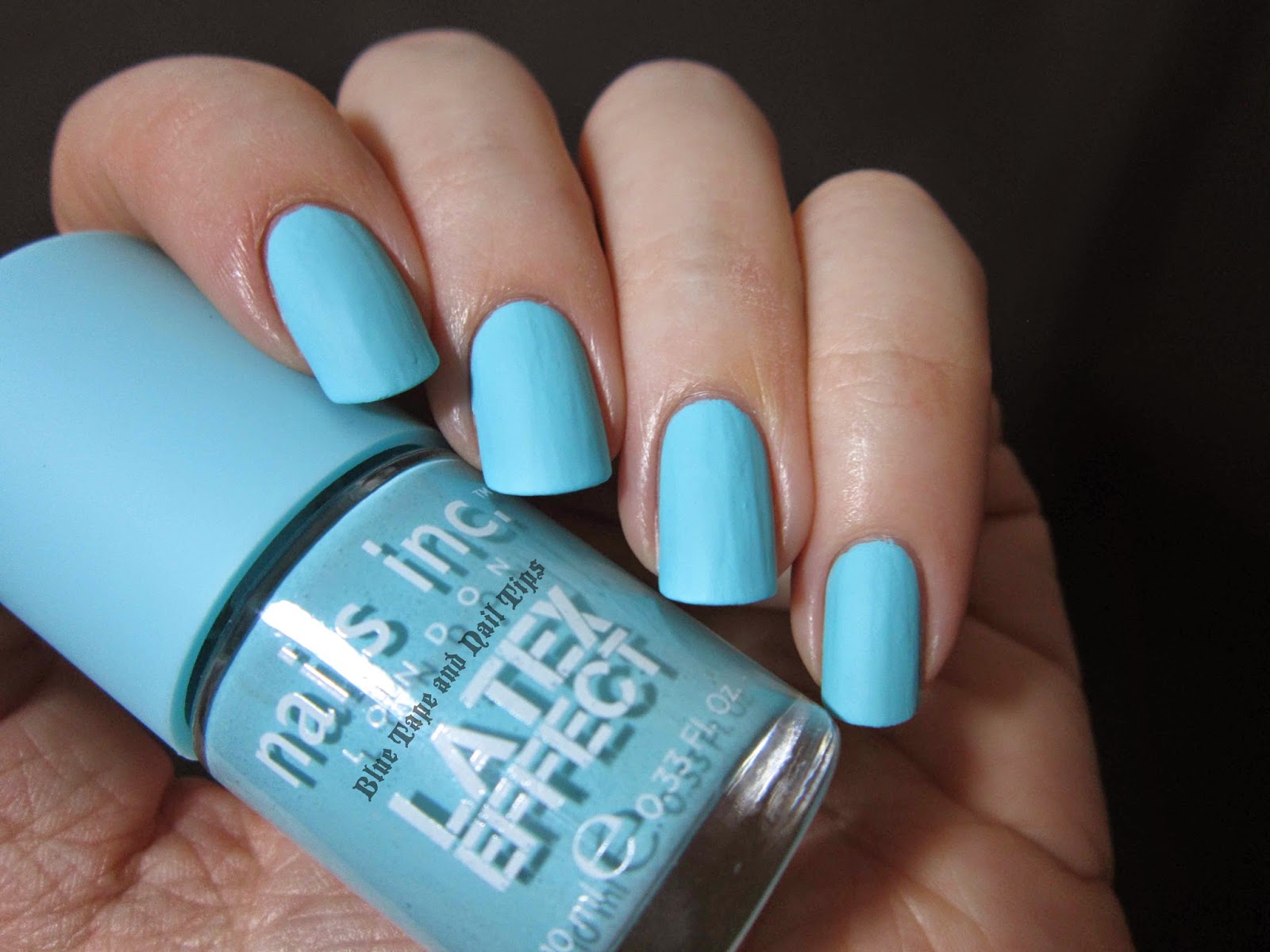
Nails Inc. Latex Effect Swatches


Nails Inc. has a few new collections out that are currently available on their website or on Sephora's website.  One of these new collections is the Latex Effect collection.  As of today, while I am writing this post, I just checked the Sephora website and it says these polishes are now available in stores.

I originally bought these 4 weeks ago online to see what they were like, so I only picked up 2 colors to test out of the 4 colors available in this collection.  Take a look below to see what you think of the 2 polishes I picked up to see what you think:


  no base coat, 2 coats Portobello Road, no top coat

The first polish I will show you is Portobello Road.  A beautiful light pink in the bottle, and on the nails the color is the same.  Unfortunately, the color is where the prettiness stops, since this polish was the problem child of the two I picked up (although you can see below that the other polish also has some issues).


 no base coat, 2 coats Portobello Road, no top coat

So as you may have guessed, the term "latex" used in the name of this polish collection means that these polishes have a matte finish.  I assumed the finish would be rubbery looking (half matte and half shiny), like the Illamasqua Rubber Finish polishes or the Wax That... top coat by Cult Nails.  I might describe this as a little less chalky than regular matte finishes, but it is still a matte finish polish at the end of the day.


 base coat, 2 coats Bermondsey Street, no top coat

The second polish I have to share with all of you is Bermondsey Street.  This is a light but bright turquoise-leaning blue.  If you look on Wikipedia, it looks exactly like the color they call Celeste.  I think the photos make this polish look a little bit brighter than it appears in person.


 base coat, 2 coats Bermondsey Street, no top coat

As you can see with Bermondsey Street, the polish goes on a lot smoother than with Portobello Road.  There are less ridges and the polish consistency is much easier to work with.  Out of these 2 polishes, if you are tempted by them both but unsure of which one to get, I would suggest just getting Bermondsey Street.

The other 2 polishes in this collection are Shoreditch High Street (which is described on the Sephora website as a hot pink polish) and Camden Passage (which is described as a nude polish, although the photograph of the polish makes it appear to look like a gray-beige hybrid).

If you have picked up any of these polishes in this collection I would love to hear about your experiences with them.  Was the consistency hard to work with?  Does Camden Passage appear to have the same formula issues that Portobello Road has?  I actually swatched Portobello Road 2 times before giving up since the results looked exactly the same.  This makes me wonder if it is just user error, and I have gotten so used to just putting a matte top coat on top of a polish I want to be matte, that I no longer have the careful touch needed when working with mattes.  So please, let me know how your experience working with any of these polishes from this collection goes!

Tuesday, March 18, 2014

Nails Inc Garden Party Swatches


New for Spring 2014 in Sephora stores: the Nails Inc. Garden Party Special Effects Collection!  I was so excited when I found an empty display spot for these three polishes at my local Sephora.  Unfortunately, they were not currently available online, so I had to be patient and wait for them to show up.  Luckily when they did show up on the Sephora website I was able to see they were at the Sephora inside JCPenny store nearest me.  On that note, I have found that this pattern is often true for new Nails Inc. products.  They are first available at the Sephora inside JCPenny stores before the standalone Sephora stores (and sometimes even before being available online), so check there first when looking!


 base coat, 2 coats Sinful Colors My Turn, 1 coat Westbourne Gardens, no top coat

This collection consists of three multi-hued and multi-sized glitter toppers all in a clear base.  The first I have to share is Westbourne Gardens.  This polish is mostly pink, featuring small hexagonal glitter in metallic pink, matte pink, and matte white colors.  Smaller white matte hexes are strewn throughout, along with micro matte pink hexagonal glitter.  All of the pink glitter with the white glitter thrown in creates an overall soft pink hue making this glitter polish beautiful for any spring event!


  base coat, 2 coats Sinful Colors My Turn, 1 coat Westbourne Gardens, no top coat

Next up we'll look at Portobello Gardens.  This mostly blue glitter topper features small hexagonal glitter in a cobalt metallic blue, a matte turquoise-blue, and a matte white interspersed with smaller matte white and matte light green hexagonal glitter.  Filling up the rest of the clear base is micro turquoise-blue hexagonal-shaped glitter.


  base coat, 2 coats Sinful Colors My Turn, 1 coat Portobello Gardens, no top coat

The white glitter mixed in with the bright blue glitters along with a touch of green make this the perfect winter-to-spring shade!


 base coat, 2 coats Sinful Colors My Turn, 1 coat Portobello Gardens, no top coat

The last lacquer in this collection is Princes Gardens (which I either always want to add an apostrophe to or call "Princess Gardens").


 base coat, 2 coats Sinful Colors My Turn, 1 coat Princes Gardens, no top coat

This glitter is the most multi-hued of the three, featuring small metallic lilac/lavender, matte light blue, and matte light green hexagonal glitter.  There is smaller matte white hexagonal glitter throughout, along with micro light green hexagonal glitter.


base coat, 2 coats Sinful Colors My Turn, 1 coat Princes Gardens, no top coat

All three of these glitter polishes are now available on the Sephora website or in stores if you are in the United States.  Retail price is $11US each.  If you live in another country, have you seen this collection?

If you think you've heard of the Garden Party collection before, you have.  About a year ago there was a four polish collection available on QVC's UK website that contained only one glitter polish called Grosvenor Gardens.  These two collections don't seem to be connected except by name.

What do you think of this collection?  If you want to see photos of what the display looks like so you can keep an eye out for it at your local Sephora, check out my pictures on Twitter or Instagram!